Interviews - 03 - Vrije Universiteit
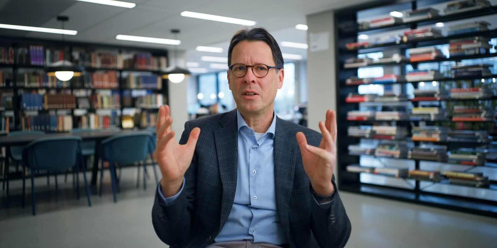
Vrije Universiteit, Amsterdam, NL
Sony FX6 - Thypoch Simera-C 35mm
After leaving the UK, we knew that we wanted to capture a completely different feel for the portion of the film that was sent in the Netherlands. We chose to go for a more modern looking palette that was still visually connected to our other scenes. This library fit the bill perfectly.
Location
Vrije Universiteit in Amsterdam is in the more modern part of the city, and is a distinctly more modern feeling campus. We wanted to lean into that and visually demonstrate that we were now in an entirely different country. That said, this interview still needed to serve the role of a visual through-line for the rest of the project. The center framing certainly helps, but we asked for photos of libraries primarily.
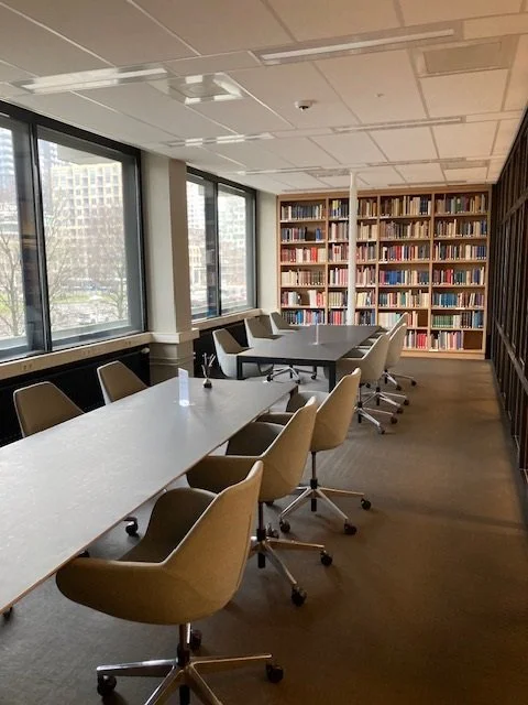
Vrije Universiteit - The first library room we saw
The first library room we were sent by the university looked extremely promising: a nice bank of windows to motivate a key light, and interesting bookground in the back to provide texture, and the ability to move the tables and chairs out made me think this was going to be our spot. When we arrived on location, we quickly learned that the room was much, much smaller than the photo made it appear.
Luckily, the rest of the floor was open for us to use, and we were pretty quickly able to find the frame that became our final look. It had excellent progressive depth, with the bookshelves creating perfect leading lines towards are subject.
Balancing a new look that also feels connect to the whole can sometimes be a challenge, but in this case this library was a cheat code. It had the book shelves and academic aesthetic of the Yarnton location, while at the same time lending an entirely different look to the video.
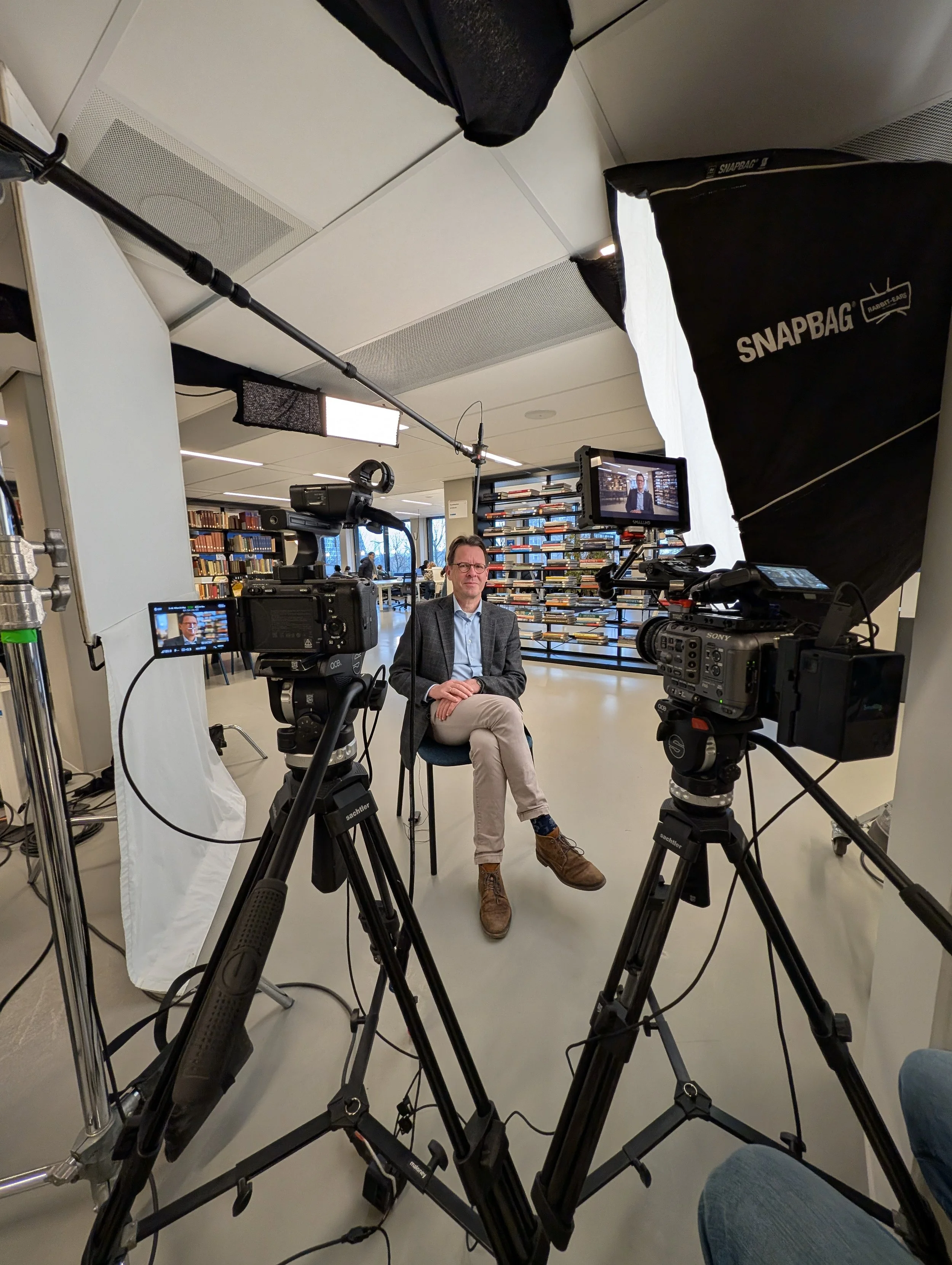
Vrije Universiteit - The room we eventually shot in.
The Shot
One of the biggest challenges in this location was the abundance of overhead lighting. In particular, two ceiling lights were directly in front of his face, washing out the shadow side and making it difficult to control the contrast on his face. That was solved with some strategically placed duvetyne, which you can see at the top of the photo.
Our key light in this shot was a Creamsource Vortex8 with an Octobank on it: with so much diffusion in front of the light from the Octobank, it didn’t matter that it was a completely different fixture from what we used in the UK. Since we had the practical fixtures on the left side of the frame, we placed our key on the right side to create visual contrast across the frame. The right side of his face is bright, the left side is dark, the lights above the table create another bright section, and then the levels fall off again on the right side of the frame. “Zebra patterning” by creating pockets of light and dark across a frame is one tool that can create visual appeal in a frame.
We added a 4×4 bounce on the left to return a little bit of level, and an Aputure Infinibar as a hairlight motivated by the overhead lighting visible in the background of the final shot. Levels and color were balanced to those lights, since they couldn’t be dimmed. This left the windows feeling blue, which actually played into the overall look of the footage we shot during our time in Amsterdam.
Final Thoughts
Being able to control the light in a space is crucial to creating a good frame. Thanks to an awesome gaffer and assistant, we were able to create the look we needed in this space to help push our story into the Netherlands!
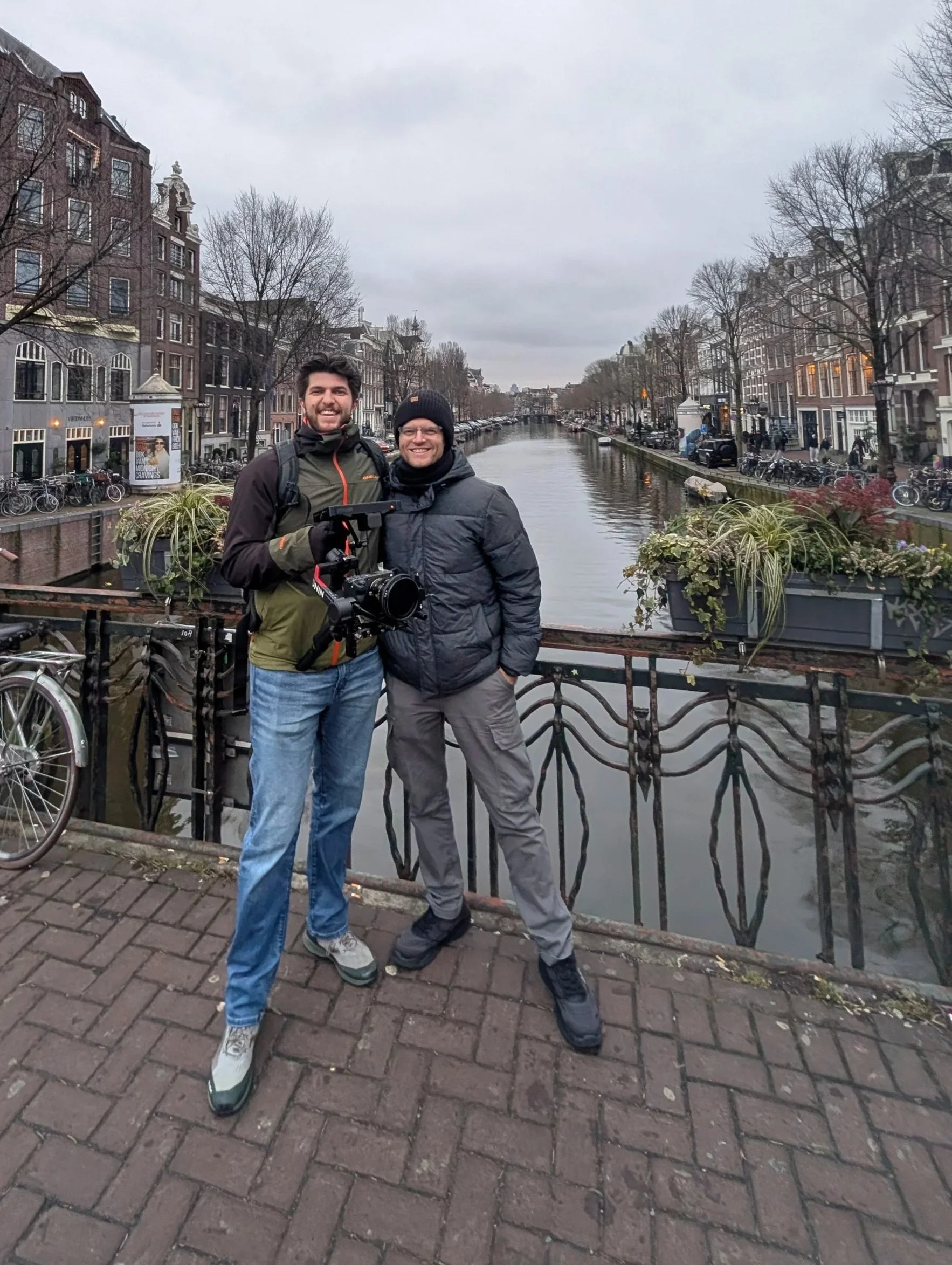
Our b-cam op, Jonathan, and I at one of the canals while we were shooting b-roll.
